Revamped Age Verification Experience
Overview
Creators must complete age verification before they can broadcast and earn money on the platform, but the existing experience made that critical first step harder than it needed to be.
Unclear requirements, fragmented steps, and limited visibility into verification status caused confusion and drop-off throughout the onboarding journey. I led the redesign of the end-to-end broadcaster registration and age-verification experience, using research and usability testing to simplify the process, improve transparency, and help more creators successfully reach their first broadcast.
Impact: +8.5% conversion · +3.1% task completion · +11% approval rate
NDA — Visuals have been recolored and altered to respect confidentiality. The design decisions described here are unchanged.
Role
Lead Product Designer
Timeline
2024 - 2025
Team
Product Manager, Engineering Team, Product Designer
Status
Released on desktop in 2025
The Problem
Unclear next steps
5/5 participants were unsure about what to do next during the waiting stage.
The funnel showed significant drop-off during age verification
Age verification is a required step before creators can start broadcasting and earning tips. However, funnel data showed that a significant number of creators were dropping off before completing the process.
While the data revealed where users were leaving, it didn't explain why. I conducted user interviews and usability testing to understand what was preventing creators from moving forward.
Funnel Data
The biggest drop-offs occurred during age verification: 67% of creators dropped before completing third-party ID verification, followed by another 79% drop before signing the agreement. Once creators reached the final step, 98% successfully completed the process.
The Opportunity
User Interview
To better understand the friction behind the numbers, I conducted 5 user interviews and usability tests, walking participants through the existing registration and age-verification experience. I observed how they navigated the flow, where they hesitated or backtracked, and what they expected to happen at each stage.
The research revealed that completing the verification itself wasn't the biggest barrier. The larger issue was the experience surrounding it: creators often weren't sure what they needed to do, whether their verification was processing, or what would happen next.
Poor status visibility
4/5 participants took a regressive path when returning to check their verification progress.
Lack of trust & transparency
Participants wanted clearer explanations around why their ID and selfie were required, how their information would be used, and how long verification would take.
How might we make age verification feel less like a black box and more like a guided journey?
The opportunity wasn't simply to reduce the number of steps. It was to give creators clarity, visibility, and confidence throughout the process—from understanding why verification is required to knowing exactly where they stand and what happens next.
The Solution
02 Make a complex process easier to scan
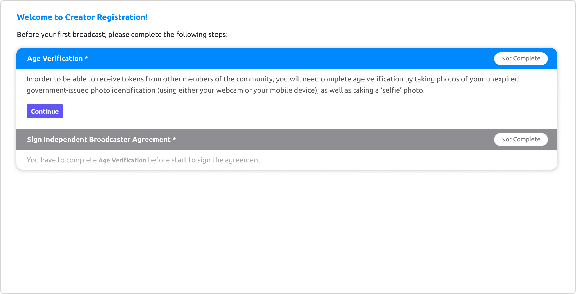
The original experience relied heavily on dense text and lacked a clear visual hierarchy, making it difficult for creators to quickly understand what was required of them.
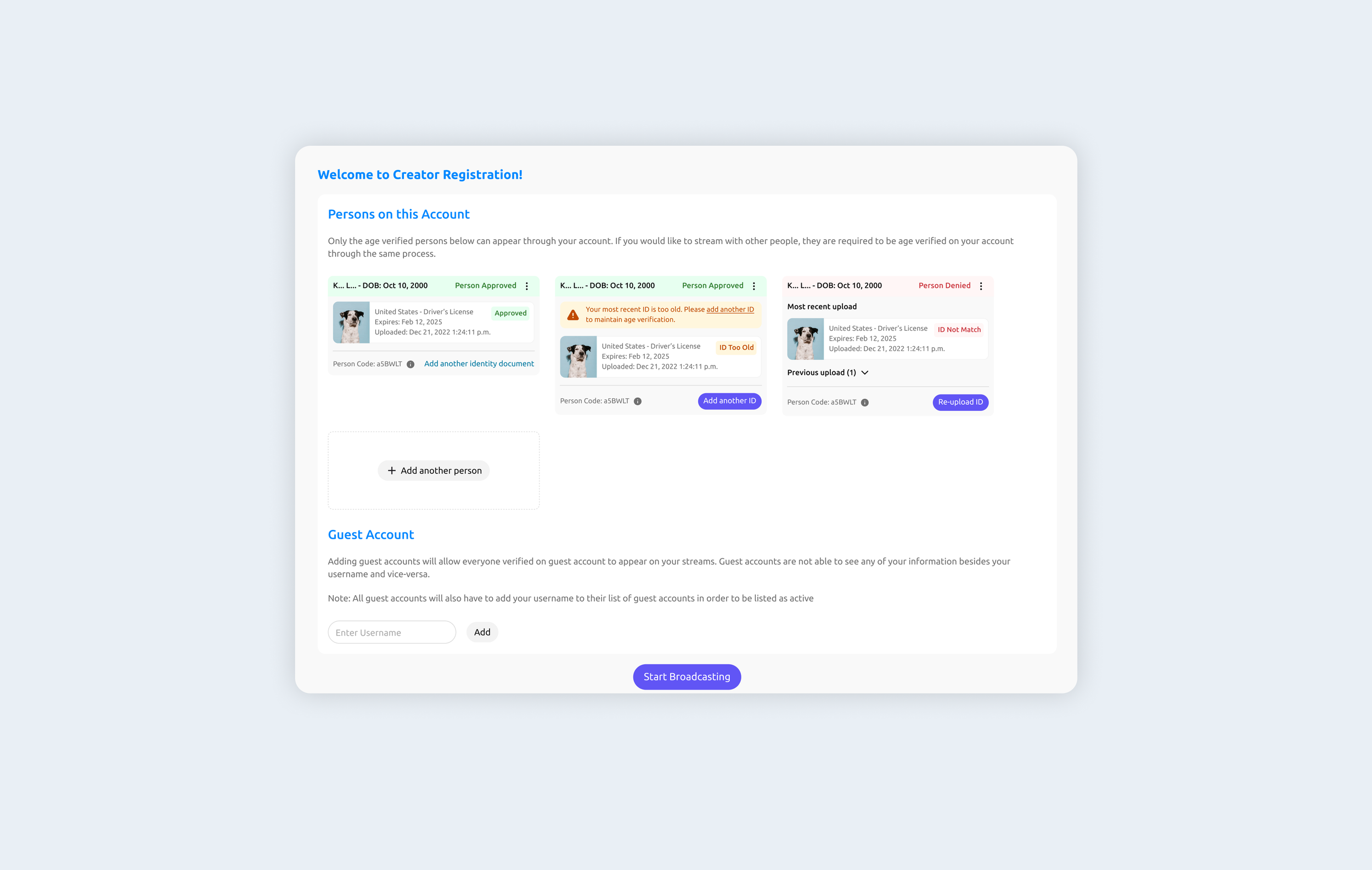
I restructured the page around the most important actions and information, reducing visual noise and introducing clearer hierarchy so creators could quickly scan the page and understand what needed their attention.
01 Turn verification into a trackable journey
Instead of presenting verification as a series of disconnected screens, I reorganized the experience into a clear, step-by-step journey.
Before starting, creators can see what the process involves and what to expect. Once verification is underway, the same structure becomes a progress tracker—showing what they've completed, where they are now, and what comes next.
Old design (Page structure)

User flow (What creators need to go through before their 1st stream)

Idea 1 - Progress tracker in profile
I explored making verification progress accessible from the creator’s profile, giving them a persistent place to return and check their status.
While this addressed the progress-tracking issue, the experience was too hidden. Creators might not discover it before starting verification, meaning it did little to set expectations upfront or help them understand the full journey from the beginning.
This led me to explore making progress part of the verification experience itself, rather than a separate destination creators had to find.
Idea 2 - making all requirements visible upfront
My second iteration surfaced all required steps on the registration page so creators could understand what was expected before starting. However, displaying the steps as expanded sections introduced too much information at once and still didn't provide a clear sense of progression.
Final Direction — Integrating progress into the journey
I moved the progress indicator directly into the verification flow, keeping the overall journey visible without competing with the task at hand.
This approach gives creators context and focus at the same time: they can immediately understand the steps ahead, see where they currently are, and stay focused on completing one action at a time.
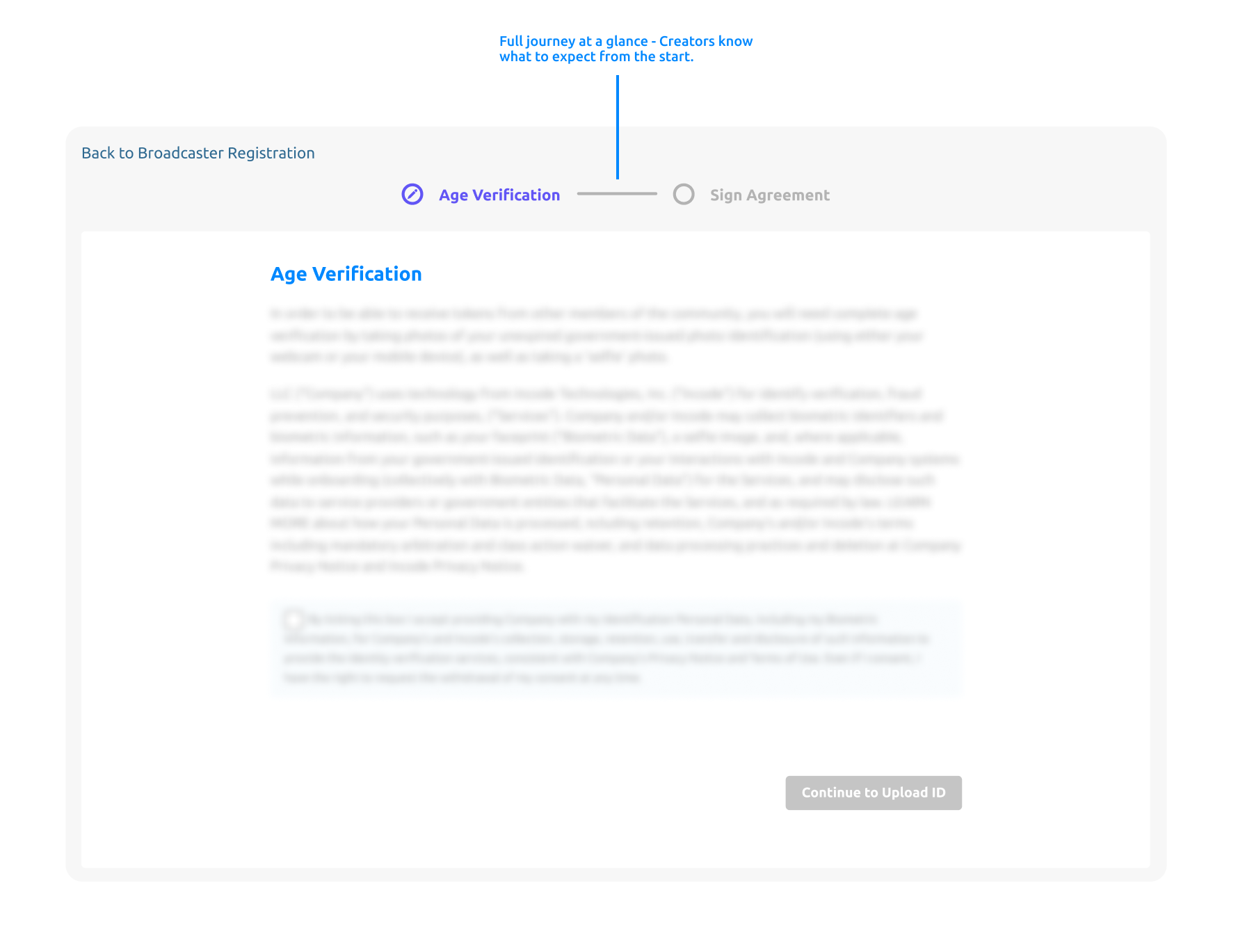
The final design balances transparency with focus, showing creators the full journey while guiding them through one step at a time.
New design (Page structure)
I also redesigned the person cards to make each person's verification status and required actions more immediately recognizable, especially for accounts with multiple people who need to be verified.
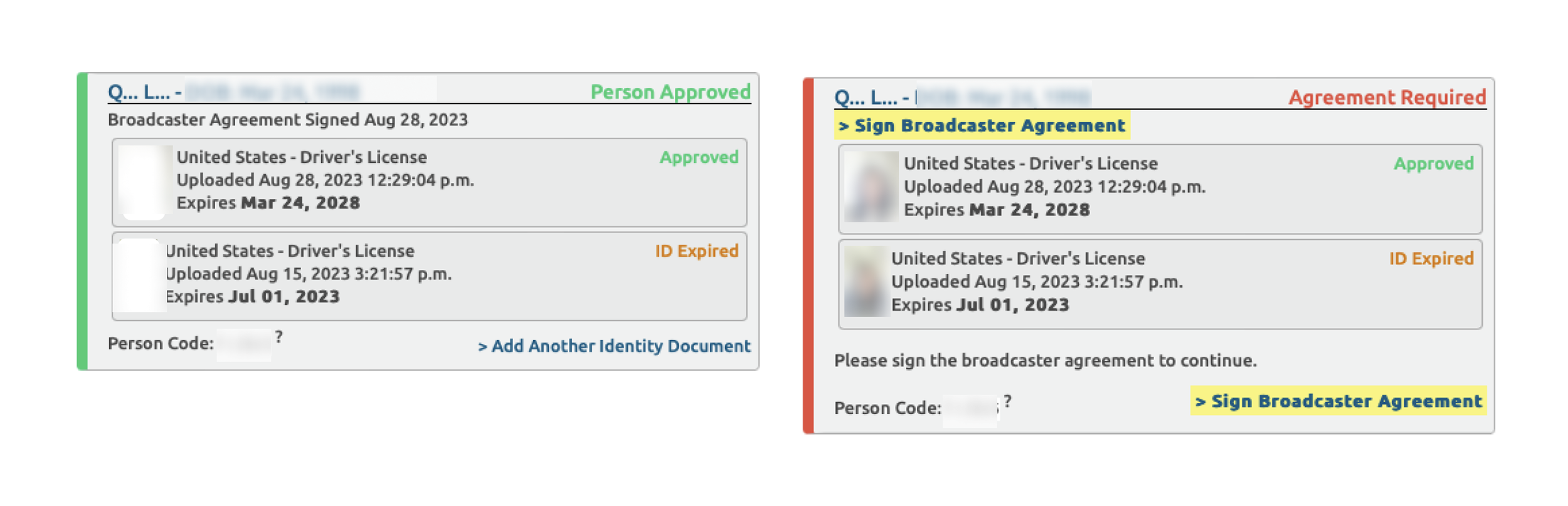
Old design (Person card)
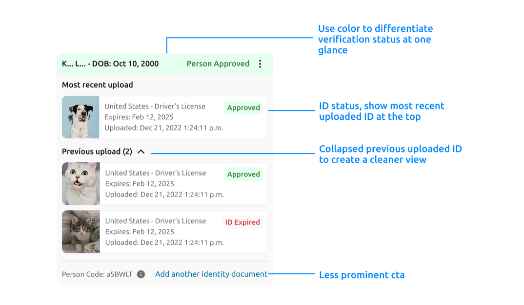
New design (Person card)
New design (other person card status)
The Results
Testing the redesign with real creators
I partnered with Product and Data to evaluate the redesign through a split test, comparing the new experience against the existing flow and tracking performance across key stages of creator registration and age verification.
We focused on three signals: whether more creators continued into verification, successfully completed the required tasks, and ultimately received approval.
The redesign improved performance across the funnel
Conversion
+8.5%
Task completion
+3.1%
Approval rate
+11%
The redesigned experience outperformed the existing flow across all three key metrics, suggesting that clearer expectations, stronger information hierarchy, and visible progress helped more creators successfully move through age verification.
What I Learned
Reducing friction doesn't always mean reducing steps.
The biggest opportunity wasn't removing requirements from a necessary verification process, it was reducing the uncertainty around them. By making the journey visible, setting expectations upfront, and clearly communicating what happens next, we made a complex process easier to navigate without changing the underlying requirements.